








During our Accessibility Development for Interactive Media course, we researched how accessibility can look in games. The goal was to suggest accessibility improvements on an existing game.
I decided to look into Clair Obscure: Expedition 33, as it's the studio Sandfall Interactive's first released title, and it took the world by storm! I figured that even though the game is a marvel to behold, there might be areas that can be improved upon regarding accessibility.
I looked into how settings can be visualized in the menus, visibility and auditorial support, redesigned the subtitles for the cutscenes, and made some combat adjustments accessible.
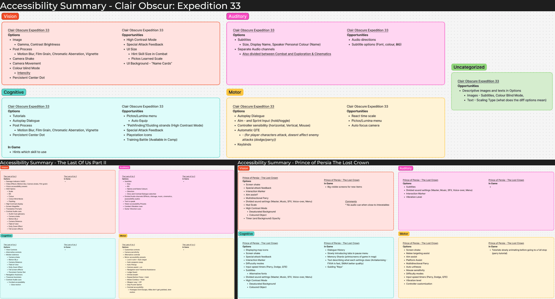
Combined with lectures about accessibility in games, I also looked into other games with good accessibility. I chose to focus on The Last of Us Part II and Prince of Persia The Lost Crown, as they won Game of the Year's Innovation In Accessibility category in 2020 and 2024.

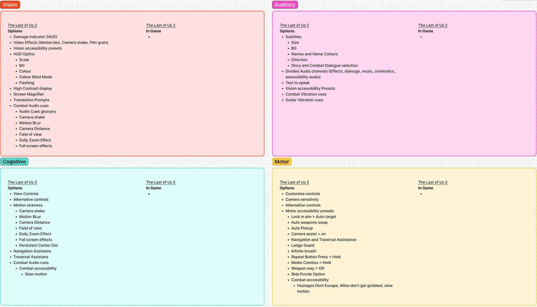
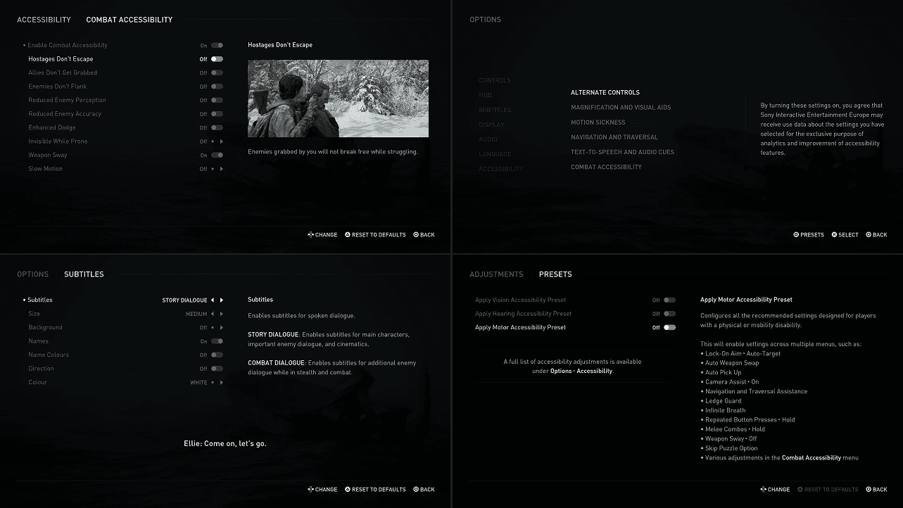
The Last of Us Part II stood out to me with its immense amount of adjustability. The game both had accessibility Presets for Motor, Hearing, and Vision disabilities, but also the depth of details the player could change to make the game fit their needs, like "Hostages Don't Escape" and "Enhanced Dodge". Unfortunately I didn't have access to the game so I couldn't personally test the settings or see the full width, but of what I could see through Game UI Database the game has a lot of options!
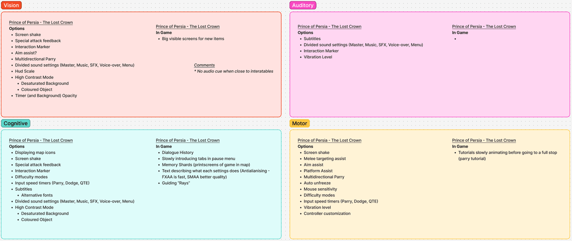
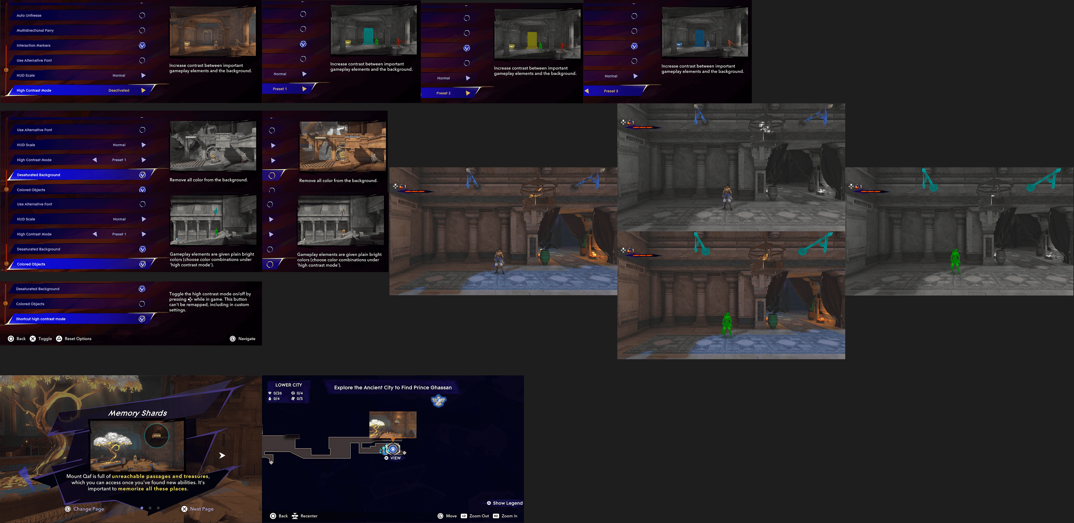
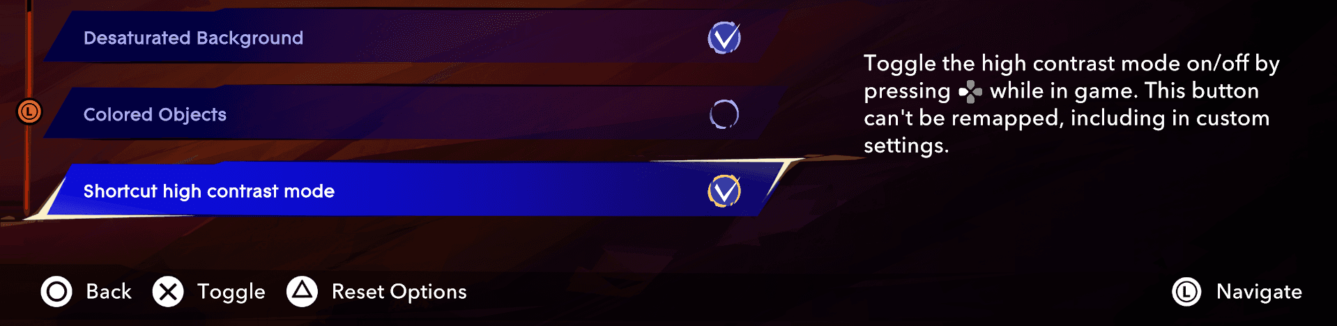
Prince of Persia The Lost Crown stood out to me with its versatile High Contrast Mode. It not only allowed for different colour presets for the high contrast mode, but also the ability to enable or disable Desaturated Background or Coloured Objects, as well as a shortcut button to toggle the High Contrast Mode on or off whenever the player wants. Another thing that stood out where its Memory Shards, which is "printscreens" saved to the map so the player doesn't have to rely solely on their memory when backtracking.

Credit where credit is due, Sandfall Interactive have clearly thought about accessibility! But compared to The Last of Us Part II and Prince of Persia The Lost Crown there where still areas of opportunities that I could work with.
Menu Visibility
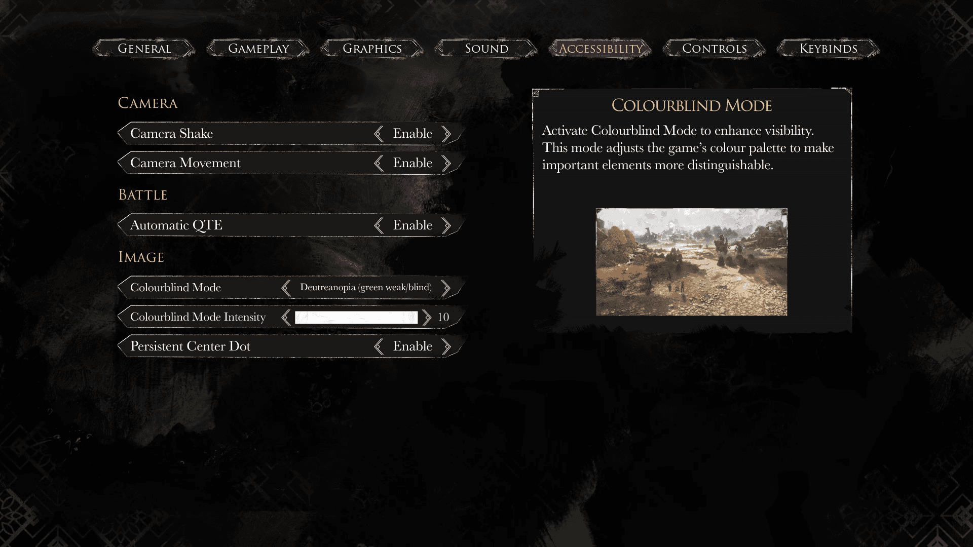
One thing I reacted on early where that the menu didn't show any Preview of the settings. Settings that regarded visuals like Subtitles or Colourblind Mode required the player to jump in and out of the menu to change the settings to fit them, and subtitles that only show in cutscenes made it even harder for players to adjust them.
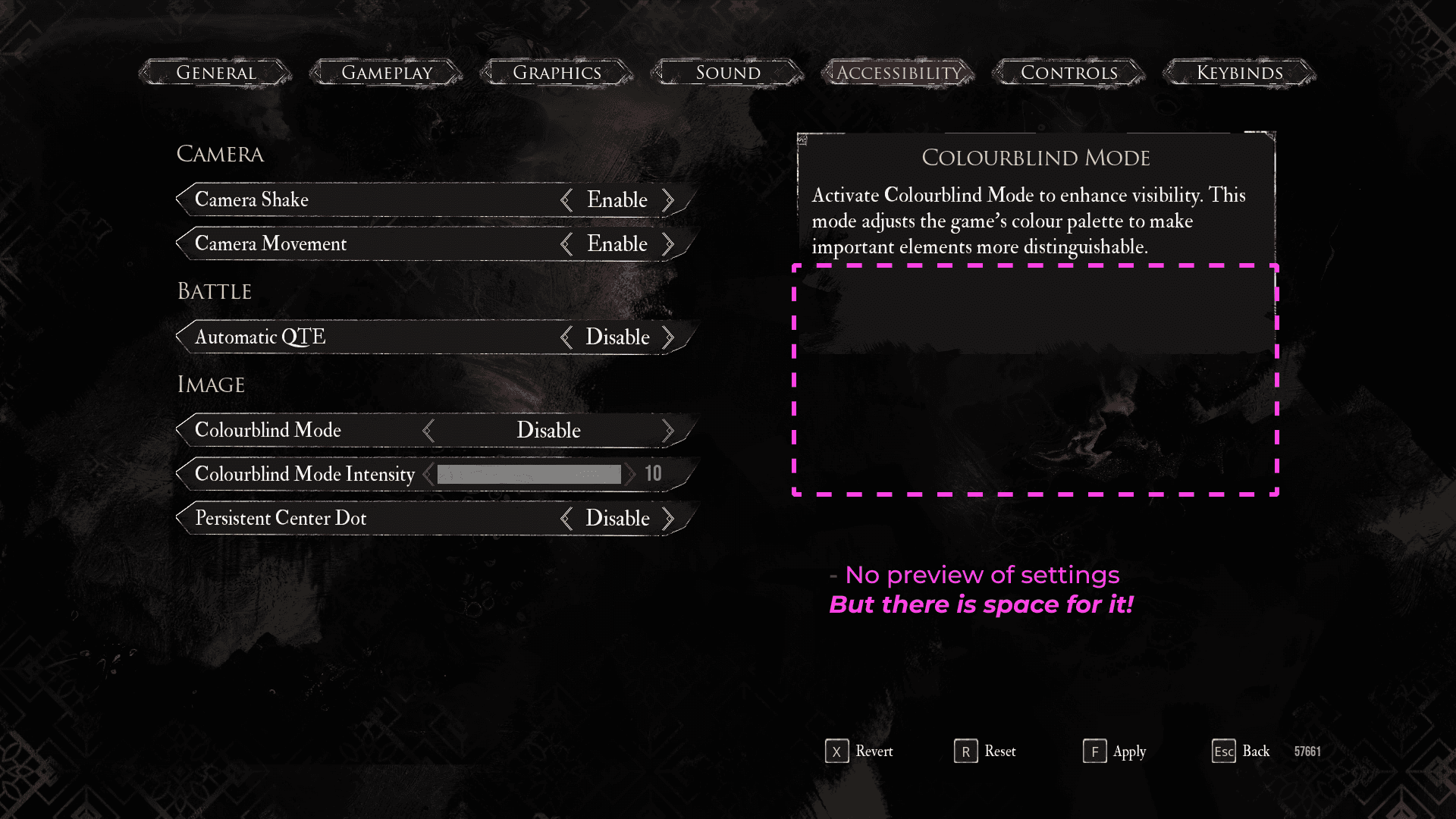
Changing settings doesn't give any feedback on how it's changing.
Preview window showing the Colourblind Settings in the menu, allowing players to see what's happening while they adjust the settings.
But Colourblind Mode unfortunately doesn't help colourblind players to see colours clearer. Instead having an even more adjustable High Contrast Mode would make the game more visually accessible!
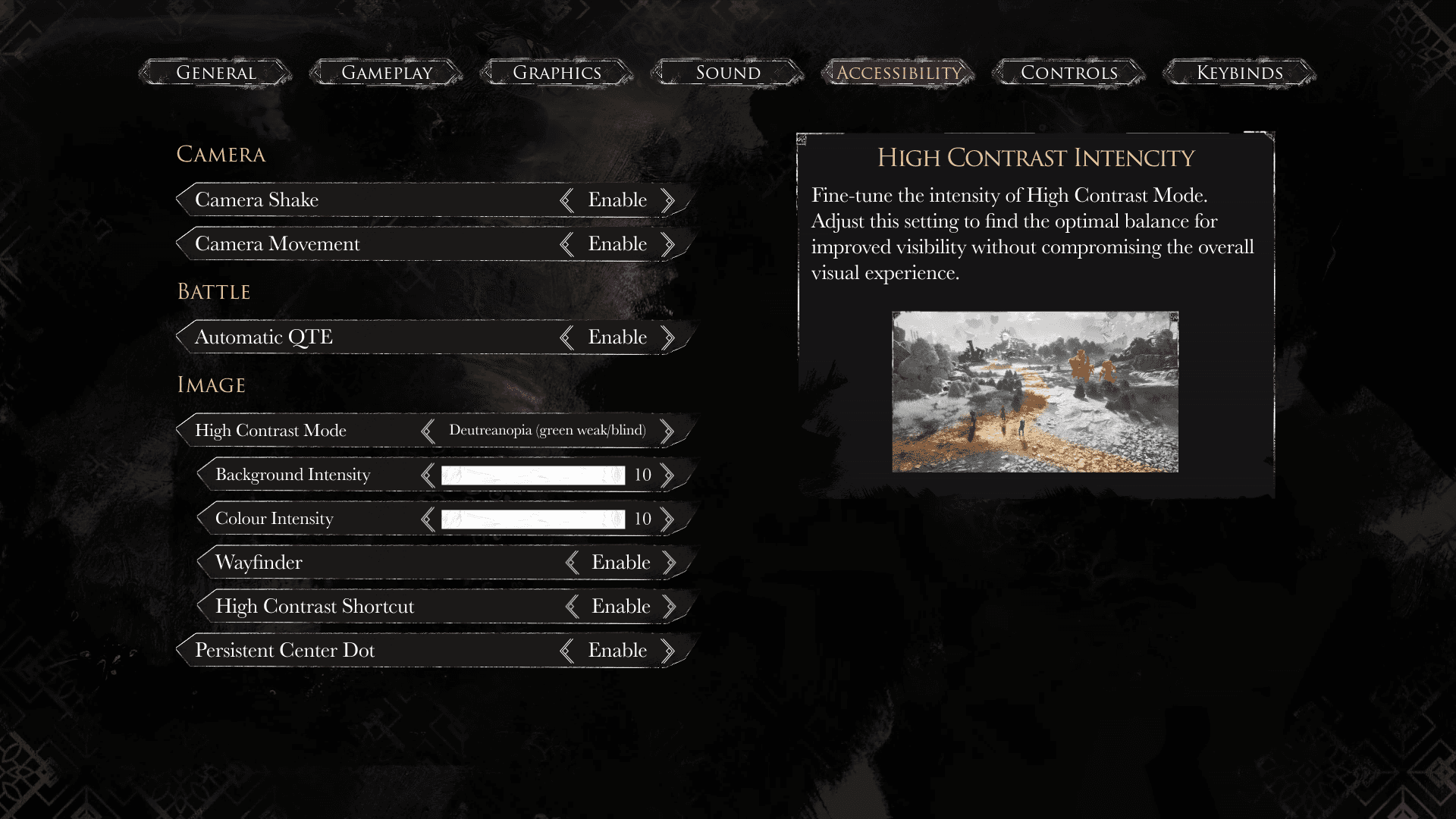
High Contrast Mode - Disable or enabling, while choosing colours depending on the different colourblindess types.
Adjustable Colour and Desaturation Intensities, combining the adjustability from the previous Colourblind Mode with Prince of Persia's versatile High Contrast Mode.
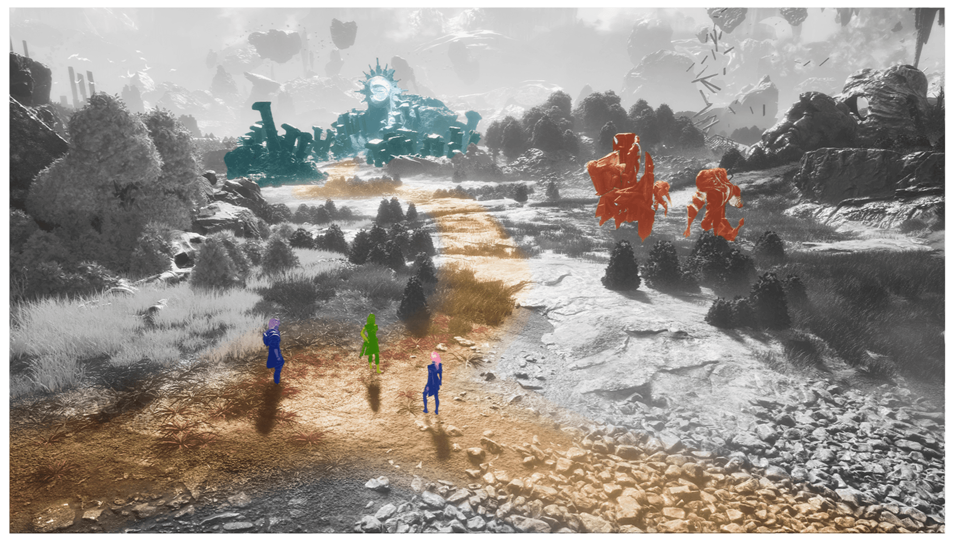
Wayfinder - Allowing some of the grounds colour to remain to inform the player of where to go next.
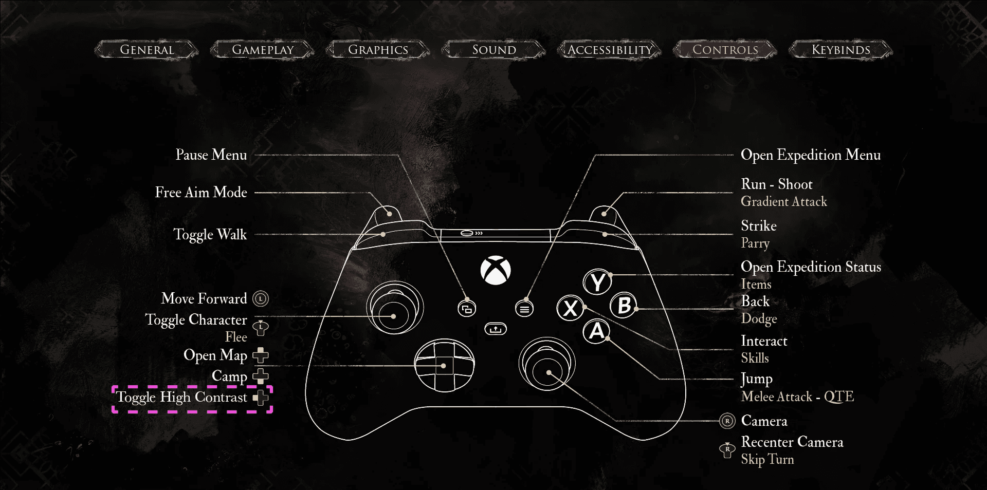
Shortcut to quickly toggle High Contrast on and off, and as luck would have it nothing where bound to the button used in Prince of Persia so players wouldn't have to re-learn where the toggle is.
Gradient Attack
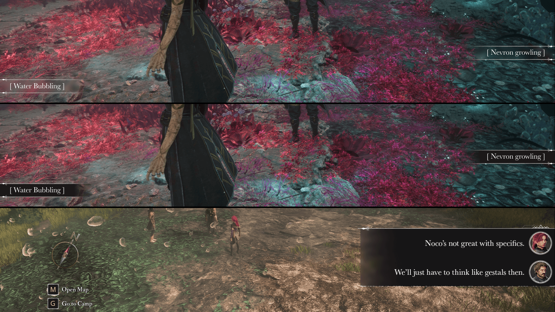
When I found that desaturated backgrounds where already implemented when certain abilities where unlocked, I felt like I had struck gold. But then came a curveball, Gradient Attacks uses the desaturated background in its mechanic! My solution then where to have the background turn even darker when Gradient kicks in.
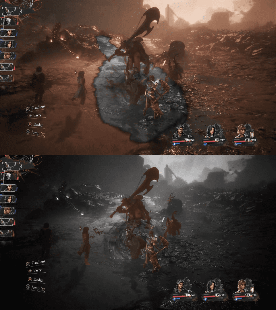
Desaturated background is already a mechanic, signaling a dangerous attack.
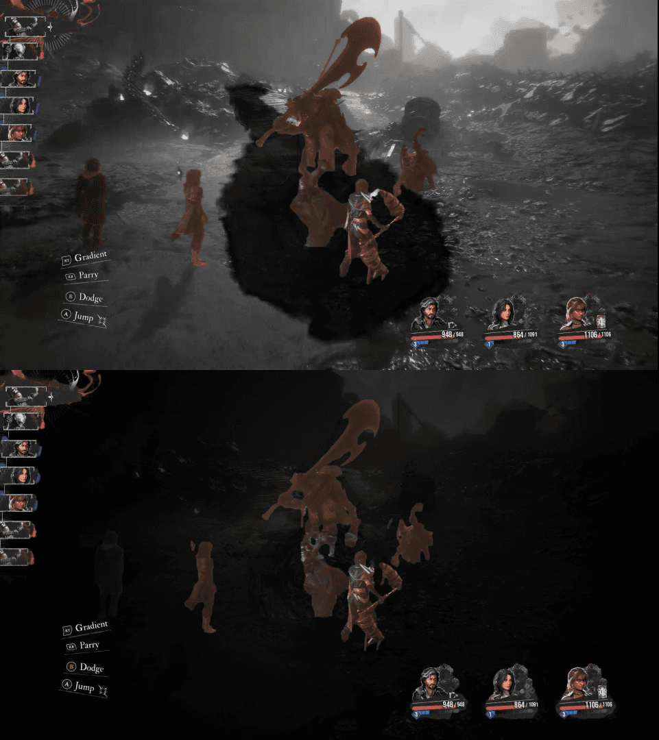
Darker background during Gradient, to ensure the visual distinction doesn't get lost as well as even further lifting the visibility of the characters.
Subtitle Design
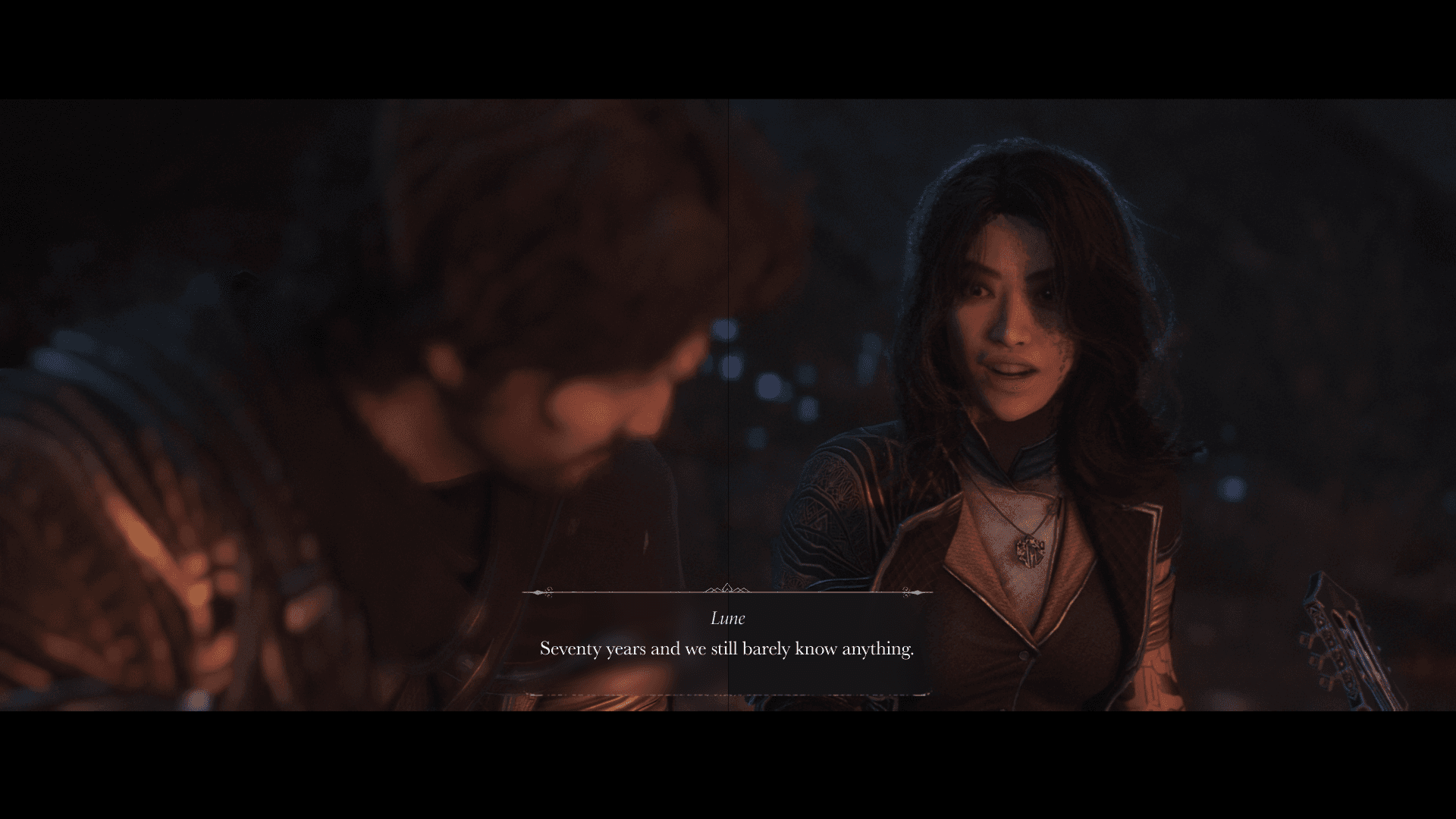
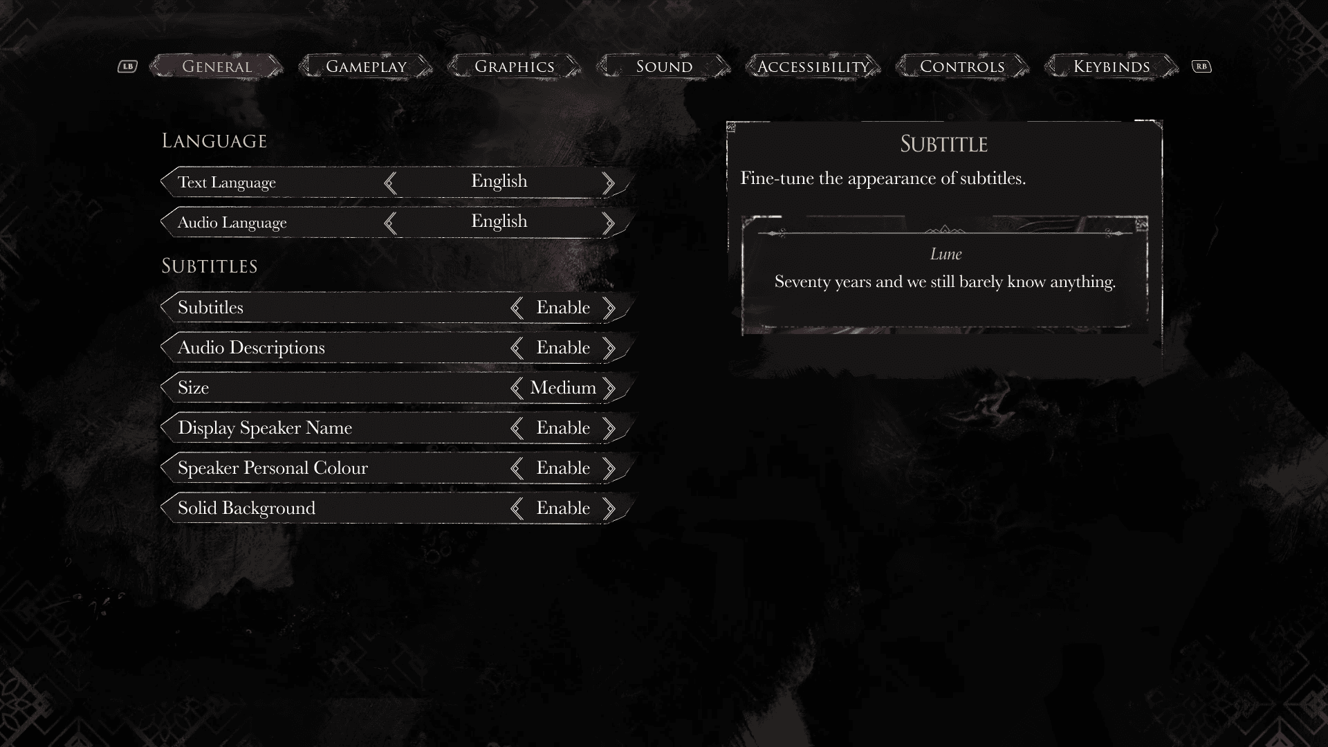
For a game with such a beautiful and well thought through aesthetics, the subtitles in the cutscenes did not match. The text line would break at unnecessary times, it where contained in a rounded box that doesn't match the rest of the game's style, and the only background being blurred made the text hard to read at times. So while making a mockup for the subtitle menu, I decided to re-design how the subtitle frame could match the overall style without taking over.
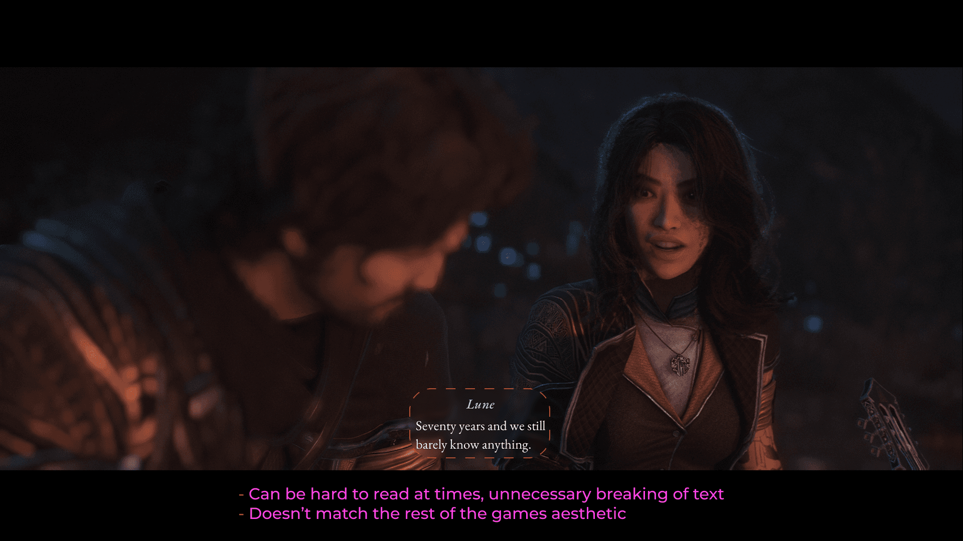
Doesn't match the rest of the game's style
Text breaks at unnecessary times
White backgrounds, or backgrounds matching the speakers name makes the text hard to read
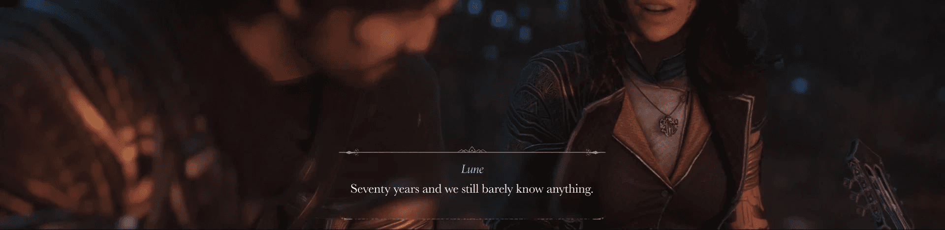
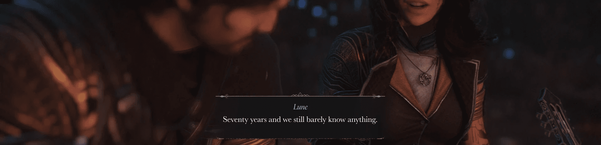
Gave the subtitles an altered version of the exploration subtitles frame
Made the text area wider as to not break the text unnecessary
The ability to add background to the subtitles for better readability
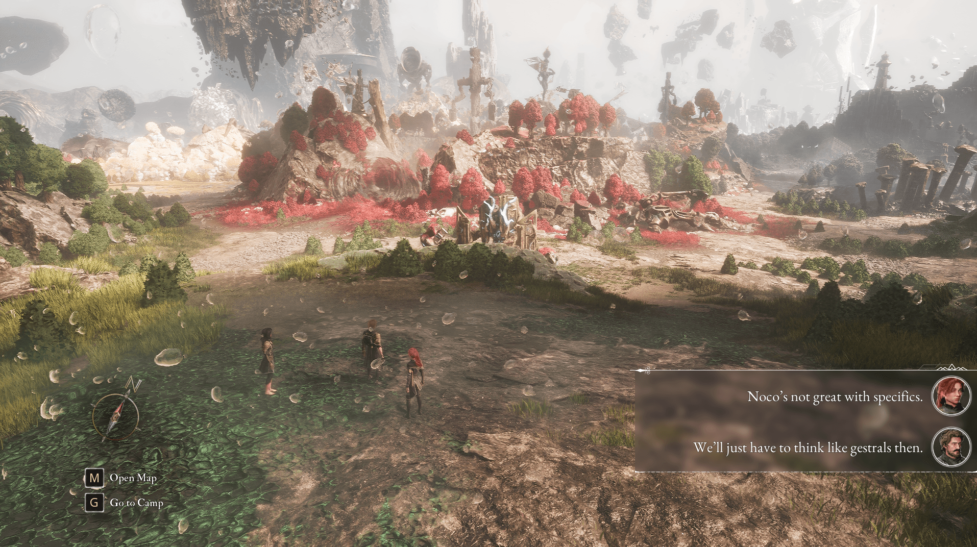
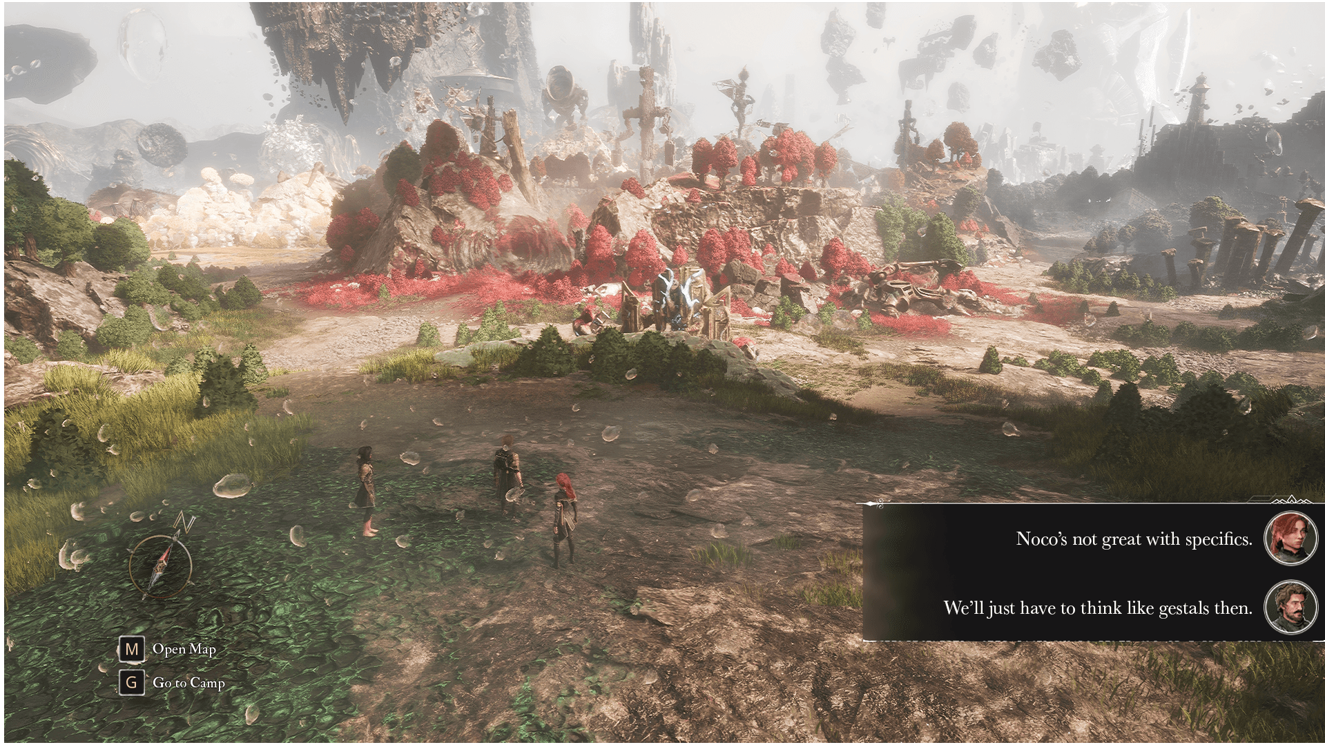
The ability to add background to the subtitles for better readability
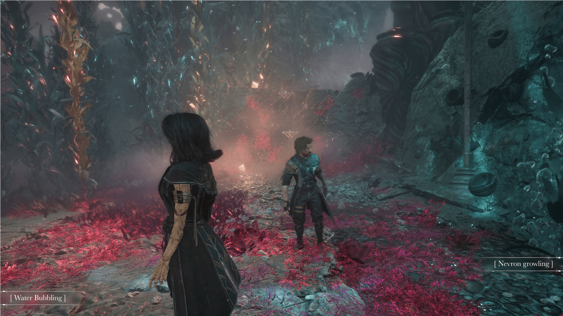
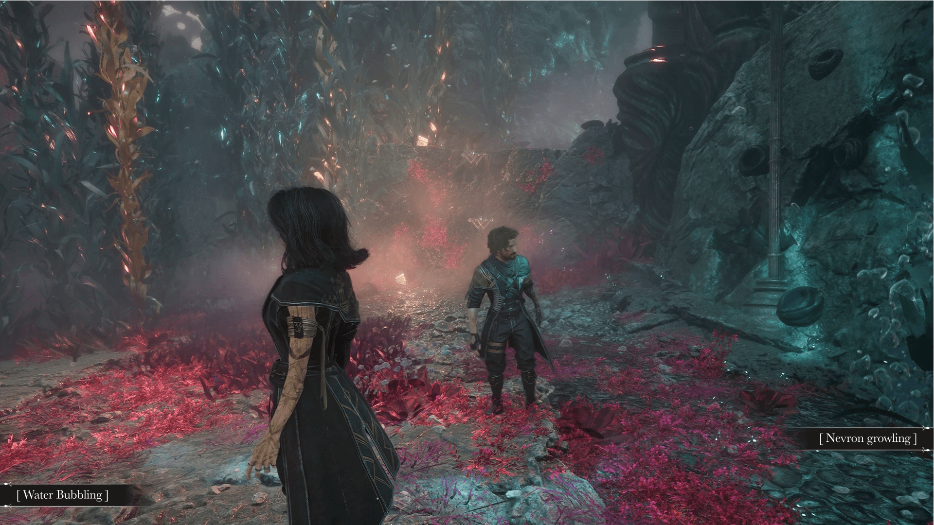
A visual way to relay to the player what they hear, and from what direction. I had a moment that I heard Nevrons around a corner, and if I didn't hear them before seeing them and slowed down I would've run right into them.
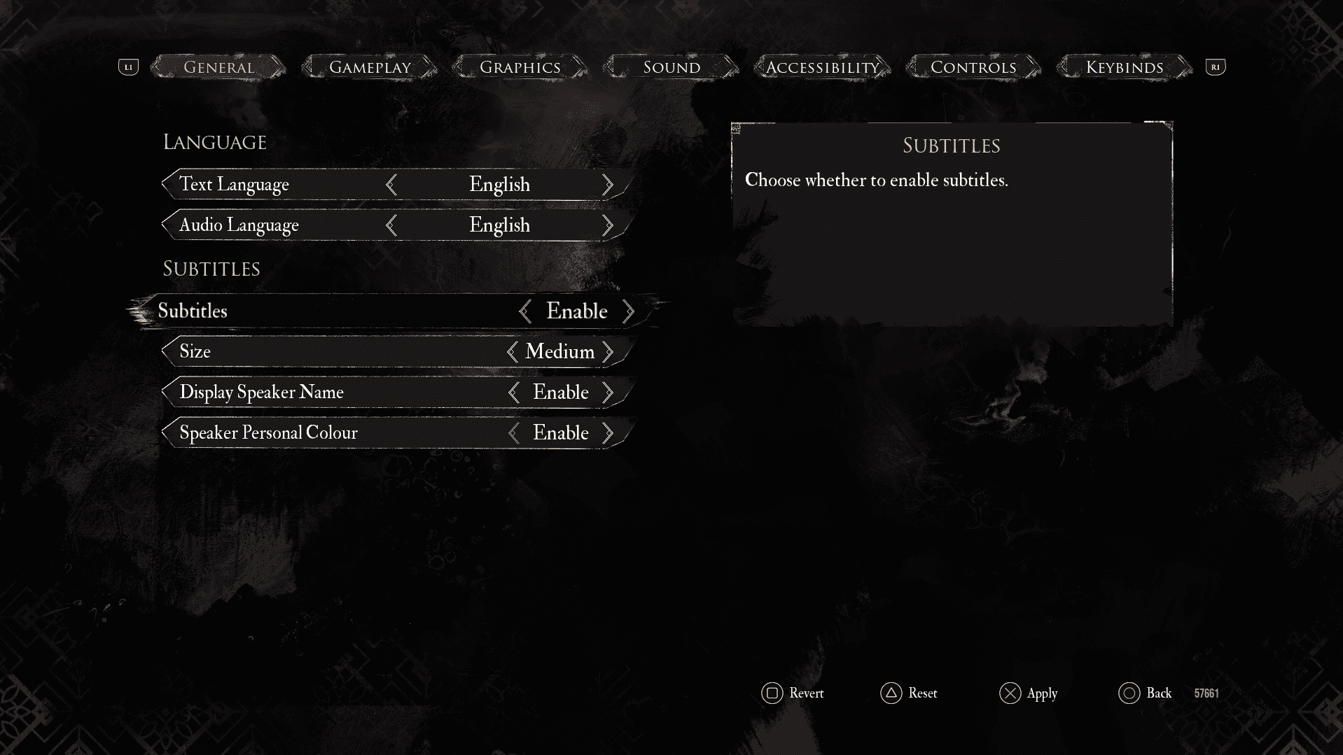
No visual feedback for the settings
Visible preview showing an example dialogue.
Solid Background - Enabling the subtitles to have a solid background, making the text more visible as different scenes can make the text hard to read.
Audio Description - Small descriptive text informing players with auditory disabilities (see example bellow).
Equip Pictos
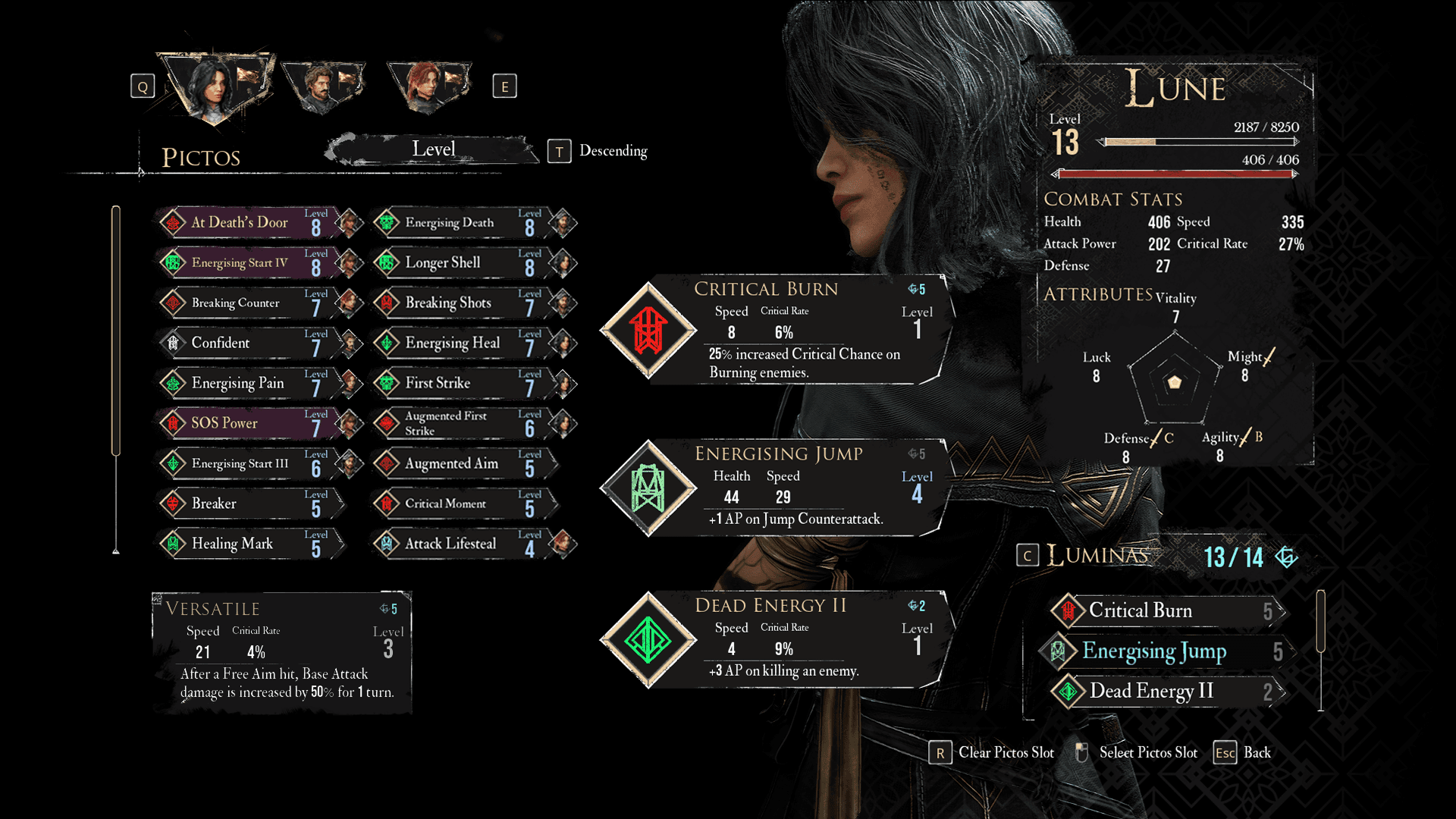
I have a love/hate relationship with the Pictos-Lumina system. I love that you have the possibility to learn and equip Pictos as Luminas for points, allowing you to have more abilities than the three Pictos slots you can fill. But it can be a cognitive overload figuring out what to equip as Pictos and what to equip as Luminas for One character, even more overloading when you have more characters unlocked.
I originally thought of redesigning the whole menu system for equipping Pictos-Luminas, but I felt that it would require more time than I had. Especially considering I'd want to get the full scope of the amount of Pictos the game entails, to ensure the redesign would work for the full game and not just parts of it. Instead I decided to adjust the Pictos Menu to make the it a little less cognitively overloading.
Original Design - Pictos Menu
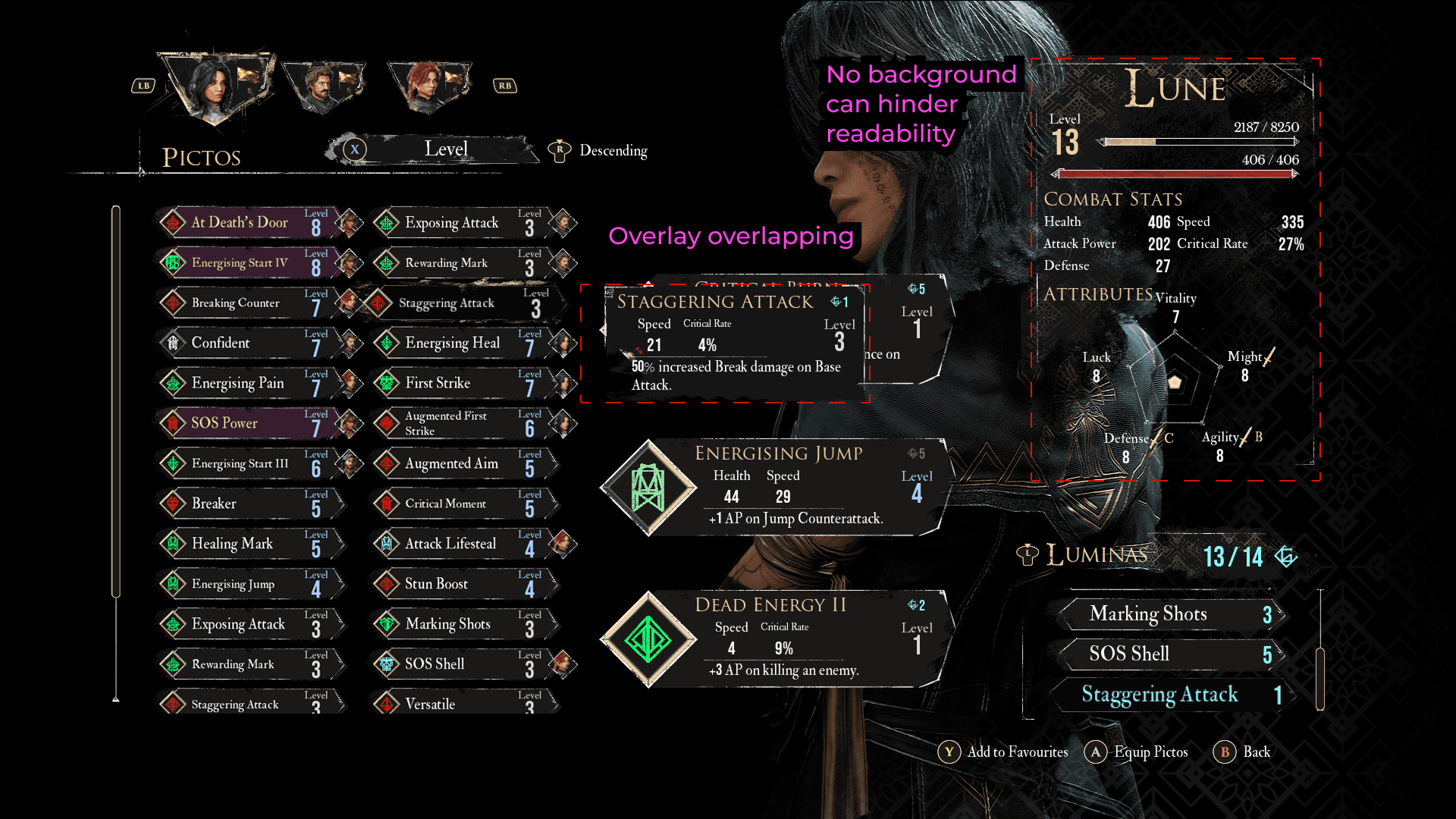
Pictos Information Overlay overlaps the equipped Pictos, obscuring the information underneath it.
The Character Information doesn't have a background, which can make it hard to read depending on what character is under and their costumes.
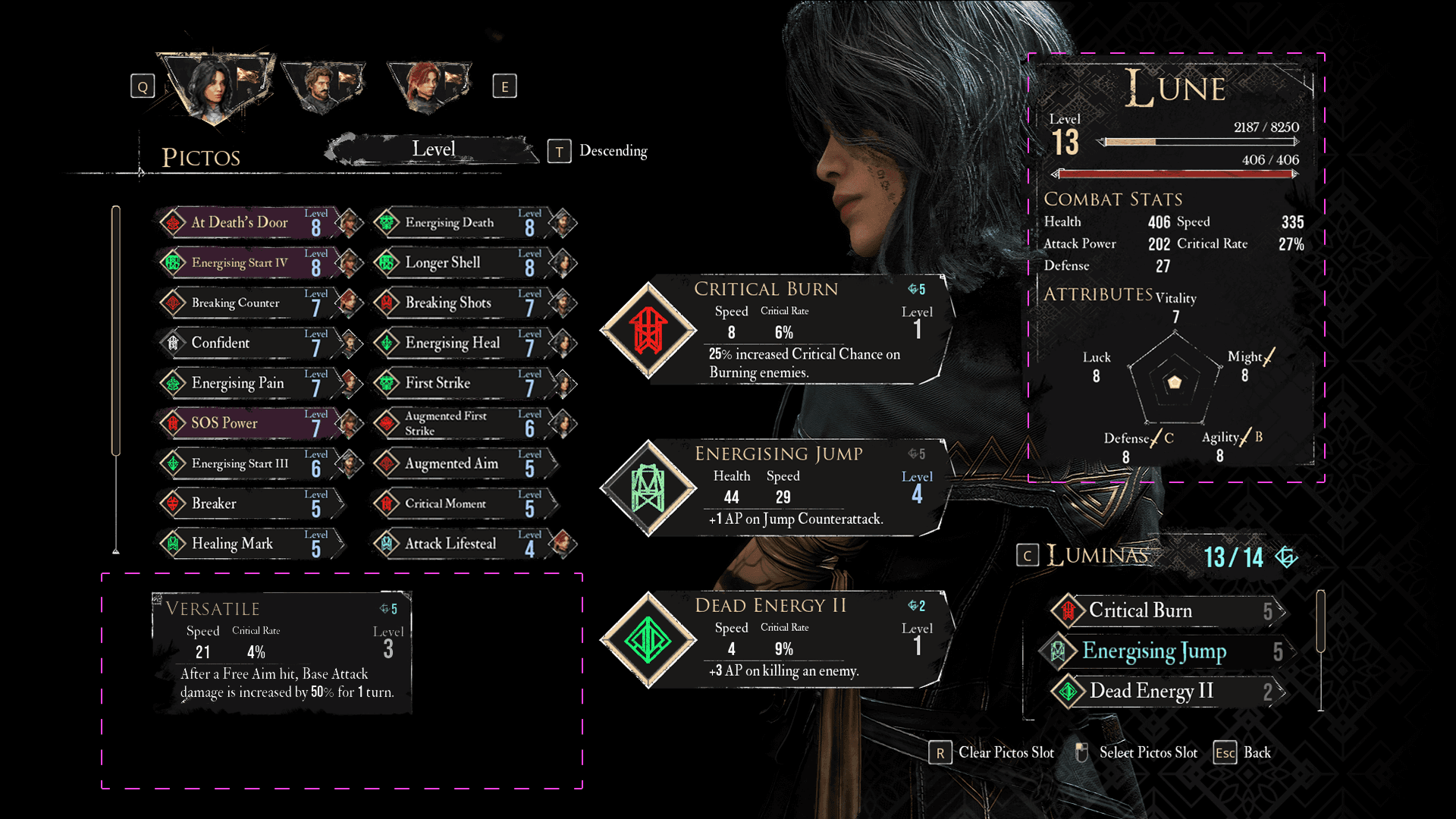
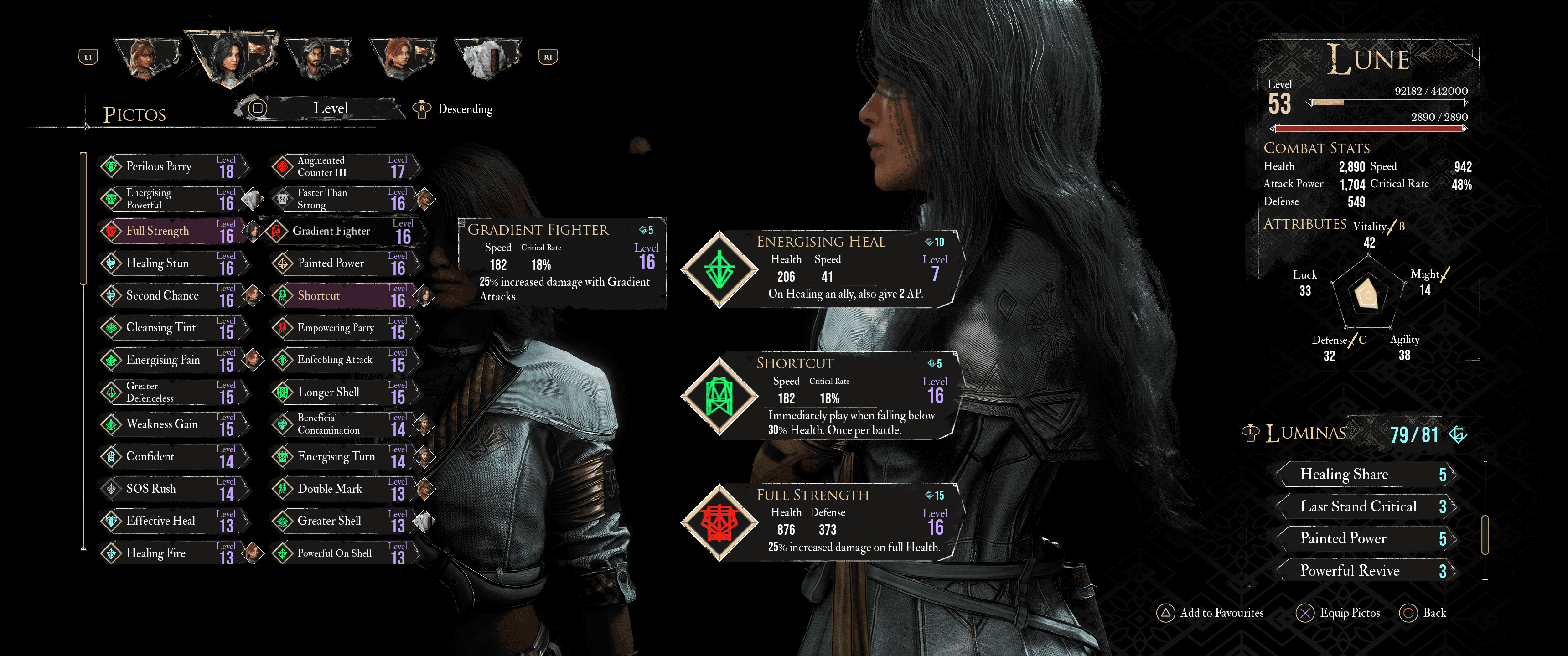
As the amount of Pictos already is scrollable, I decided to make the visible list a little smaller to allow space for the Pictos Information Overlay under it, ensuring its not overlapping important information for making decisions.
Allowing the Character information to have a background can help readability, as different characters and costumes can worsen the readability.
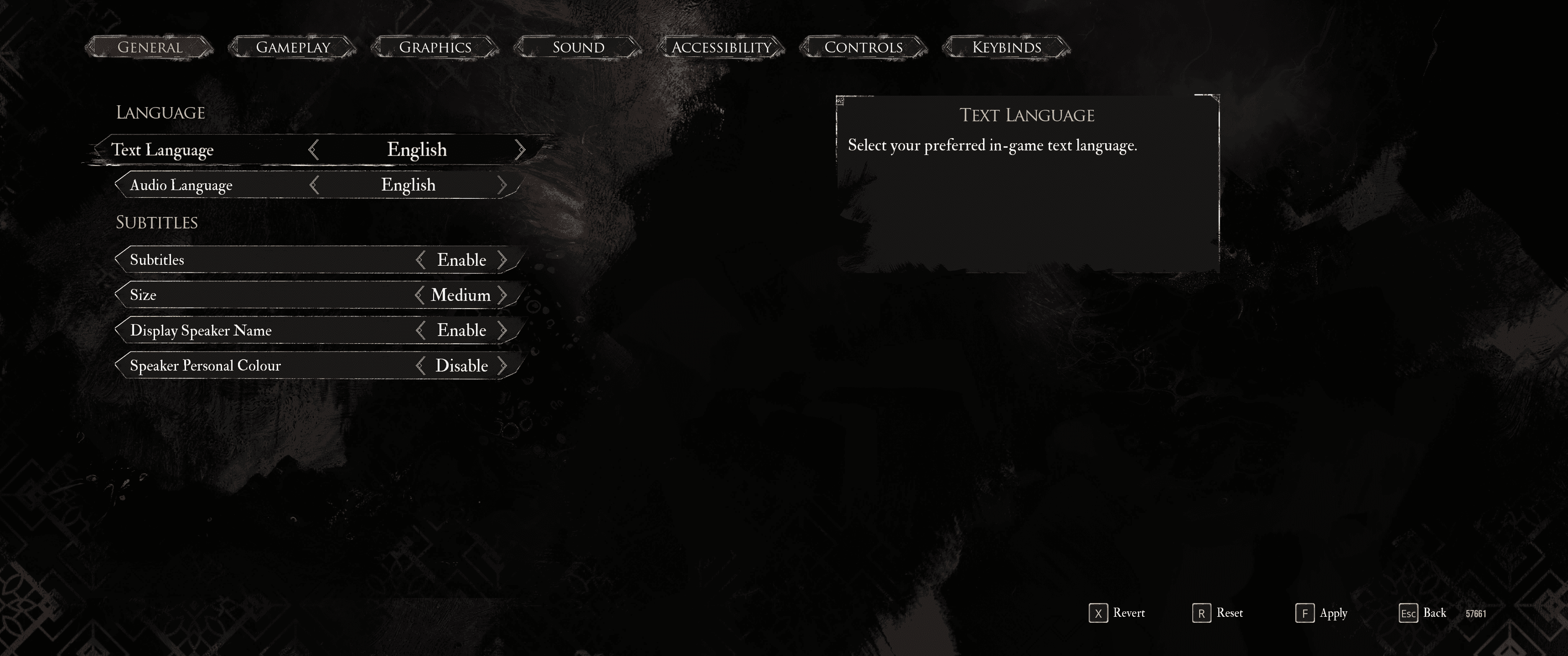
Though something that confused me where that the original layout works with widescreen! But the settings layout made me believe the game weren't optimized for it to be played on a widescreen
Battle Adjustments
Inspired by Last of Us Part II's immense amount of adjustability, I also added some battle adjustability.
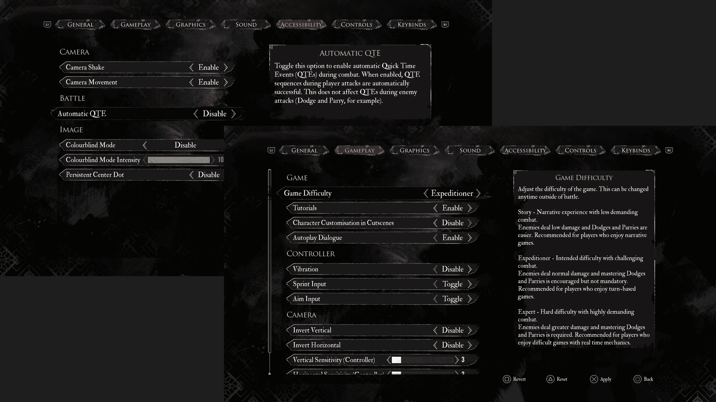
Only battle adjustments are "Game Difficulty" and "Automatic QTE".
They're in separate places.
"Game difficulty" also accessible via the Accessibility tab, as it's better to have settings reachable through different menus.
"Game Difficulty" still sets the overall settings, but can switch to "custom" if the player changes settings beneath it.
"React Window" is the the time the player has to react to attacks and QTE.
Take Aways
There is a lot that goes into making a game accessible. But my two biggest ones is that it's something that should be taken to consideration right from the start, and that there is a lot of misconceptions regarding accessibility.
Disability doesn't mean a sickness or that something is wrong with a person, it's a mismatch between a person and their environment, and accessibility is a correction of that mismatch. Some accessible features might not seem like they are just that, for example subtitles that's an accessibility feature for auditory disabilities. And even further some features can be helpful for more than the intended disability, again using subtitles as an example as a lot of people using subtitles might not have any problem hearing, but having cognitive disabilities that gets supported by reading instead of just listening. But there are also times when a accessibility feature isn't helping as intended, like with colour blindess mode as it doesn't alleviate their disability to see certain colours.
For some transparency, I've wanted to play Clair Obscure since it release, and even bought it but couldn't find time to play it until I had this assignment that required me to play different games. Keeping in mind that I stopped to take screenshots and notes for the assignment, but by the time the assignment were due my save file said that I've played for around 10-15 hours. As of writhing this I'm closer to 40-50 hours into the game and have just completed the games story, and I've had a lot of "curveballs" like when I got to Gradient Parry after designing the High Contrast settings.
Like I mentioned before, accessibility should be taken into consideration right from the start, or should be done with the full knowledge of what the game will entail. As of the due date of the assignment I've continued to play the game for my own enjoyment, but I'd be lying if I said that different thoughts of how to improve upon the accessibility haven't crossed my mind.
Back to home page ->